SIRENS
A supporters group for SD Wave FC — for everybody in the section.
Founded in 2022, the San Diego Sirens are a supporters group built on the legacy of the mythological siren — storyteller, shapeshifter, song. Our visuals carry that weight.
This guide is the source of truth for members, creatives, and partners. It codifies what stays fixed (the wordmark, the palette, the voice) and what can breathe (the “S,” the mood, the season).
Fixed & unwavering
The wordmark, crest, palette, and typefaces do not change. They are our chant — recognizable from anywhere.
Nebulous & ever–moving
The shape around the “S” belongs to the community. It shifts by season, by tifo, by mood.
Built for the stands
Everything should read from the 90th row: high contrast, shape–led, minimum decoration.
The Symbolism of the Siren
Why we look the way we look— From our artist
“Beneath the crashing waves, you’ll find extraordinary creatures of all shapes, colors and sizes. The siren’s song beckons from the wave tops to all the denizens of the deep to sing with us in unison. Ascending, we lift, we rise, and we sing as one.”
Our siren draws from many portrayals through history — part bird, part fish, all creature. Ancient pottery showed sirens with human heads and bird bodies; Homer’s siren is a voice that enchants sailors; later traditions gave us merfolk. What stayed constant across every version is the siren as storyteller.
— Fixed elements
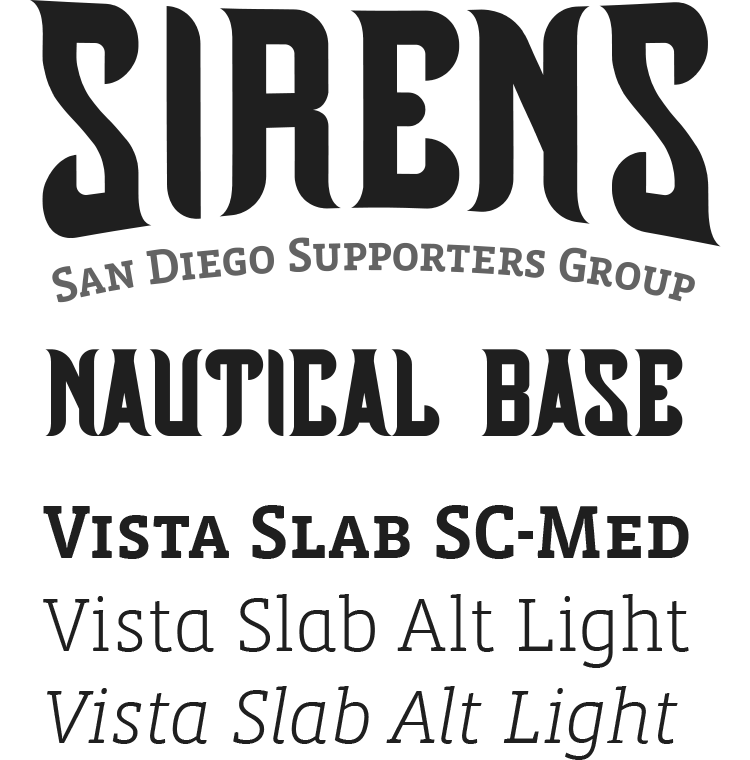
The typography. Tall. Slightly curved. Sharp. Letters nested together, clawed at the tips. Legible from a distance, set with intention.
The eye of the “I.” Prominent, half–lidded, following you. Never remove or redraw it.
The subheader. “SD Wave FC San Diego Supporters Group” sits weighted with the wordmark whenever external audiences see it.
— Variable elements
The shape behind and around the “S” is nebulous, ever–moving, always shifting forms. The community owns this slot — tifos, posters, and seasonal campaigns can fill it with waves, scales, feathers, flame, whatever the story wants. The only rule: the shape bends around the S; the S itself does not bend.
Color
Of the sea · of the sky · warm to hold them— The 60 / 30 / 10 rule
- 60% Ocean or Sand (grounds everything)
- 30% Wave Top or Sea Green (the voice)
- 10% Warm Black + seasonal accent
— Good pairings
- Ocean ground + Wave Top calls–to–action
- Sand ground + Ocean ink + Sea Green links
- Sea Green on Sand — our most bookish pairing
— Never
- Gradient between palette colors
- Pure black or cool gray (kills the warmth)
- Pink / orange in navigation, body, or buttons
- Wave Top on Sand for body copy (fails contrast)
Typography
Tall · Slightly curved · Sharp · Nested tight · Clawed tipsWe don't re-typeset it in live type — always use the official file.
Small caps slab — tagline & section headers
Web fallback: Roboto Slab (variable, loaded locally)
MATCH DAY
SAN DIEGO SUPPORTERS GROUP
Regular + italic — subheads & body copy
Web fallback: Lora
Every chant has a reason — and every member has a voice.
Pull quotes, song lyrics, long–form lore
“Ascending, we lift, we rise, and we sing as one. The siren’s song beckons from the wave tops to all the denizens of the deep.”
Small, tracked — for meta, labels, time
Matchday · Saturday 7:00 PM PT · Gate 03 · Section 137
Logo & The Variable S
Wordmark is fixed · “S” moods change
01 — Primary crest
02 — Official (white, with tagline)
Supporters Group 03 — With subheader
— Fixed (never alter)
- The letterforms & nesting of SIRENS
- The prominent eye of the “I”
- Color of type within the wordmark
- The clawed terminals at letter tips
— Variable (community owns)
- Shape behind / around the S — change per season, tifo, or campaign
- Color of the backdrop (within palette)
- Auxiliary illustrations next to the lockup
— Clear space & min size
- Min padding = cap height of the “S”
- Wordmark min 60px on screen / 0.5in print
- Drop subheader below 44px
- Use with written permission (contact@sandiegosirens.com)
Patterns & Imagery
Sea, sky & stands
Iconography
24px grid · 2.2px stroke · hand, not Helvetica— How to draw
- 24px grid, 2.2px stroke, round caps + joins
- Ocean Deep on Sand at rest; Wave Top for active state
- Avoid solid fills — keep icons linear
- If an icon needs >3 strokes, simplify it
— Hand-drawn editorial (reserved)
- Hand–drawn mascots + creatures live in press kits, zines, stickers — never in UI chrome
- Always outlined in Ocean Deep, 2–3px stroke
- Loose, DIY linework — not technical illustration
Components
Building blocks — web + printButtons
Default button is Sea Green #058293
on white (mirrors the live sandiegosirens.com CTA). Ocean Deep is
reserved for primary navigation CTAs. Flat, no drop-shadow, 6px radius.
Badges & Status
Pill shape, 1px Ocean Deep outline. Live uses Ocean + pulsing wave dot, never elsewhere.
Form fields
Tags & meta
For filters, Discord channel references, article chips. Two rows max.
Sample Surfaces
System in the wildSIRENS
Wave FC2
FC1
Voice & Writing
Storytellers — like the siren— We sound like
- Welcoming. Everyone in the section is family.
- Creative. Lyrical — borrow from songs, sea stories, lore.
- Formidable. Short sentences. Verbs first.
- Plural. Always “we,” rarely “I.”
- Nebulous. Room for members to finish the thought.
— We don’t sound like
- Brand tweet. No “unleash your passion.”
- Corporate club. We’re the fans, not the front office.
- Gatekeeping. Never “real fans only.”
- Slang–chasing. If it’s a meme, skip it.
- Emoji confetti. One, if any, per post.
“Drum’s warmed up. Flags are ironed. Kickoff at 7. Section 137 — same seats, same songs, new season. See you on the rail.”
“Are YOU ready for an unforgettable matchday experience? Join the Sirens community today and unlock exclusive member benefits!”